Estate Lenders Web App

Promoting efficiency through a user-centric web platform for Real Estate Management

Industry: Real Estate
Timeline: Set 2022 - Jan 2023 (5 months)
Role: UX Designer
Team Size: 1 UX Designer, 1 Developer

Overview

Estate Lenders, an Australian property management company, approached me to improve their client-facing registration platform. New users were struggling with a complex, single-step form used to submit property details for evaluation—a critical step in the customer journey.

Challenge

The platform’s registration flow had high drop-off rates and a poor completion rate, often leading to manual onboarding by the company’s staff. The project demanded a complete UX overhaul while maintaining compatibility with their OutSystems-based stack and respecting legal/formal input requirements.

Platform Audit & Stakeholder Interviews

  • Accessibility in car tech is still limited;
  • feedback must be easy to perceive without adding cognitive load;
  • The interface should stay non-intrusive so others can use the car normally.
Platform UI before our redesign
Heuristic-based UX audit of the platform

Benchmarking & Design Iteration

To guide the redesign, I analyzed long-form UX patterns—multi-step forms, autosave features, and smart defaults. I created moodboards and iterative wireframes based on those insights. After several feedback loops, I adapted the company’s design system for a cleaner, branded interface.

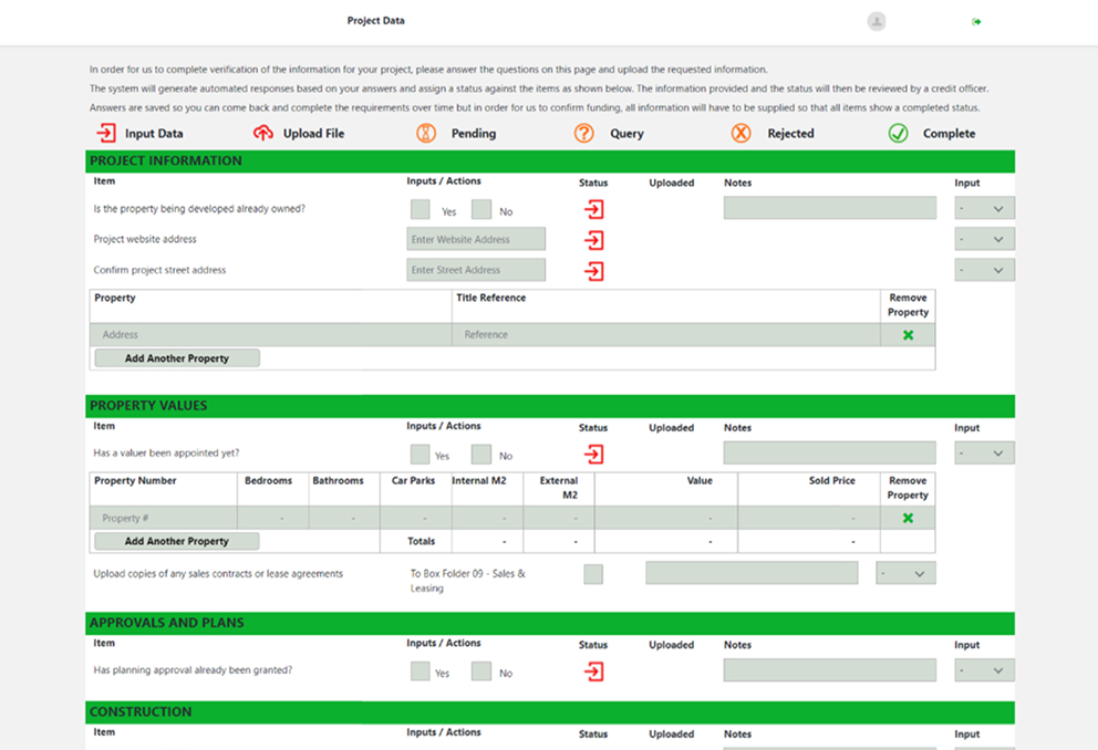
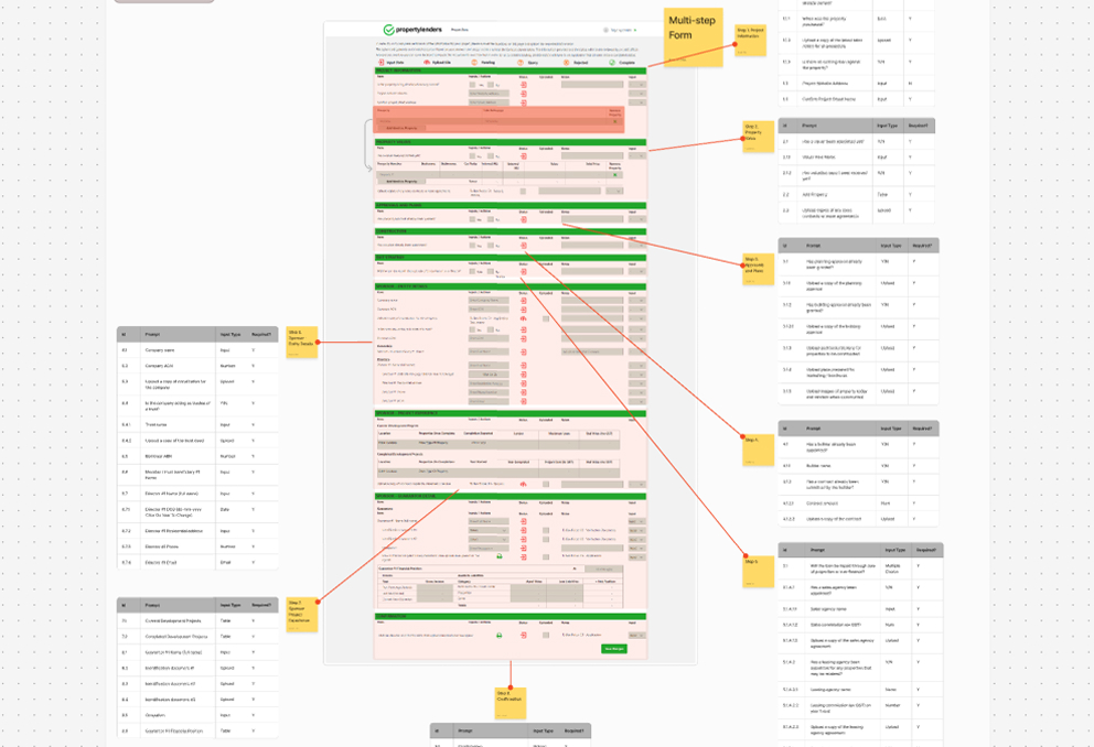
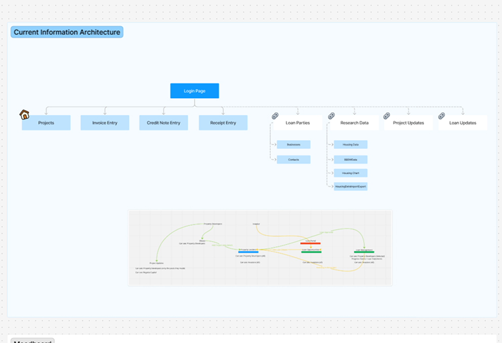
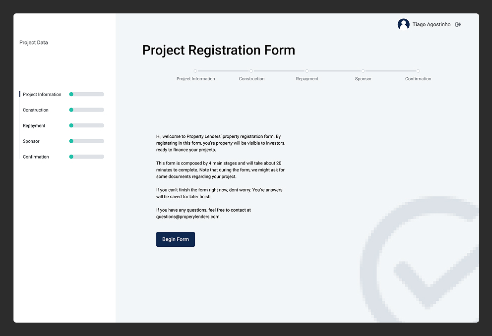
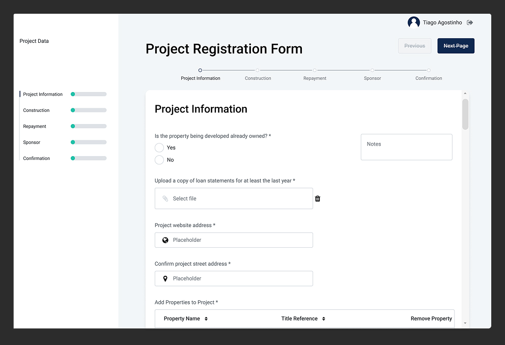
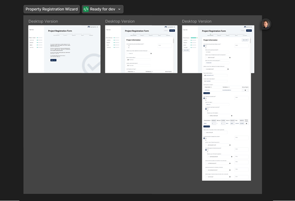
The value of UX-centric processes

One of the most impactful takeaways from this project was seeing how UX improvements can drive measurable operational gains. Beyond visual refinement, the redesign drastically improved system efficiency and user clarity. By simplifying interactions, aligning design with user workflows, and respecting implementation constraints, I helped reduce friction for multiple stakeholders in a high-usage platform—skills that directly translate to designing responsive, efficient HMIs and UIs.

Legally Compliant, User-Friendly Redesign

The final design drastically improved form clarity, grouping inputs into digestible chunks without compromising on the required information. It met all legal and operational requirements, while reducing friction for users.

Tangible UX and Brand Gains

The redesign resulted in a platform that was not only easier to use but also visually elevated to match the company’s credibility and brand identity. Stakeholders reported faster form completion rates and reduced support intervention.